Thursday 15 September 2011

Website Background

ASPHALT, ROAD, CONCRETE, TARMAC TEXTURES:


I really want a background texture of a road, with two yellow or white lines down either the left or right side, however i want a photo that does not emphasise the individual rocks in the tarmac.
I have managed to find quite a few images of what i would like; none meet the required size. it is starting to look like i'm going to have to find a road texture and apply the yellow or white lines to the background myself.


thumb-2402.jpg

road_texture_by_sleepybluekitty-d2xnzwu.jpg

Taking this image here of road tarmac, i am going to photoshop some white lines down the left hand side.

Thursday 25 August 2011

Color Scheme For Website

Color List: FF6908       07D149
                  A4663E      338676
                  803301        016854
                  FF8232       2CE0BD
                  FF9753       49E0C3

Car Kulture Deluxe Magazine

Home Screen of CK DeLuxe Magazine
 The website for the Car Kulture DeLuxe Magazine is perfect as a basis for the website design for Sandman's Hot Rod's and Customisations.
Home Screen with Interactive sectors open
 This is perfect inspiration.
Main Link Sector Top


Main Link Sector Bottom.


Thursday 18 August 2011

FONTS

In the creation of the new font for Sandman's Hotrods and Customisations I have researched some Hot-Rod and Retro fonts. The problem i am encountering is finding a retro font that is not overly elegant and maintains the rock-a-billy feel.
While Browsing Fontspace i came across a few ideas that i would like to attempt to combine to design the new font.

This font is She-Creature by Gaut Fonts. The reason i like this font is because it is slightly reminiscent of the original font that can be found on the 
                                                                                                 Holden Sandman panel vans. (See Below)


Other fonts i have viewed and believe fit the ideas are:
Grandprix Font


Airstream by Nick Curtis

Arbuckle

Little Deuce Coupe NF by Nick's Font

Lagniappe


Another image that gave me a good starting point for the font design was this image from Car Kulture Deluxe Magazine.
I like the use of Traditional Hot Rod flames that dress up a plain font.

All the above images will be a nice starting base for my font.

Thursday 19 May 2011

Website References

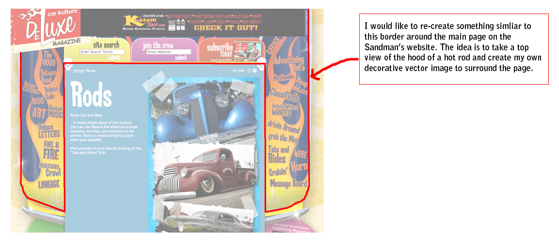
CLIENT NOTE: http://www.fullblownkustoms.com/ (Point Of Research)

Website Reference
In the planning stages of the design i have browsed the following sites in order to establish the designs that sites with similar subject-matter are using. This is to help establish and consider any conventions that are linked to hot-rods which may or may not be essential in the development of the site as easy recognition at a glance helps greatly with traffic.

Deuce Customs - Is a Victorian, Ferntree Gully Hot Rod workshop.Their design is made up of a simple banner and header featuring links, a right hand side bar of Hot Rod images linked to the specific page that informs you of part prices and over-all prices and pictures. The links that the Deuce website displays are:
-Home
-News
-Workshop
-Showroom
-Customer Gallery
-Features
-Roadster Build
-Tourer Build
-Contact Us
-Links

Castlemaine Rod Shop - Another Victorian hot-rod shop, located in Castlemaine; this website features a more intricate and textured layout. The background appears to be a vinyl texture, with brushed metal plates for a banner, there is a classic down the page layout. Underneath the banner there is a classic negative photo strip featuring images of various cars and parts. Each of the buttons are rounded almost a simulation of car buttons; featured links, flash with an outer glow.
The links are all ordered by the different parts with a search engine to find by make or model.

Classic, Mustang and Rod Shop - This website another Victorian company; features a black to white gradient box background which transparent images. A mustang adorns the banner with a links bar underneath. [About] [Services] [Gallery] [Contact Us]. (I am beginning to like the the square layout, that can lengthen to fit more information as required.

Early Hot Rod Parts - This site has a tiled image as their background, the multiple colors are a great deterrent and make the rest of the page gaudy and hard to read. On top of the background sits a black and maroon bordered box with grey inner, in which the text sits. Their links consist of; home, parts, gallery, contact us.Their logo font is hard to read with the multiple colors surrounding it.

Extreme Designs - A pinstriper/airbrushing company that specializes in painting hot rods, bikes and so on. This site is just a blog that features his work and contact details.

Henrys Parts - A very simple designed layout, with just heading bars and footer bars. The links are simple: home, about, news and events.

Logo References

The Logo References
In the consideration of the design of the logo, i browsed many examples of the '32 Ford which the company specified for the design.


These images will be used when i draw and create my own version of the car. The other requirement of the logo, was to have an hour glass somehow placed in the design. So i have collated some images of hourglasses i found inspiring.


I enjoy the broken hour glass appeal, i think this is how i will represent the hourglass in my design

IDEAS
As stated in my comment, i have combine the car with a broken hourglass, i think that having a car smashing through the center of the hourglass could pose a good solution. Another idea could be to have an hourglass resting against the car or possibly even hourglass decal.

Corporate Design Brief

 Sandman's Hot-Rods Design Brief

About the Company


Sandman Hot-Rods and Customizations is a Melbourne company that specializes in building custom hot-rods as well as customizing hot-rods, show cars and the everyday drivers. It is a small up-and-coming business situated in the Western suburbs of inner Melbourne; founded by Brody Nicholas.
The company requires the construction of a fresh corporate identity to attract business. The corporate identity will require the creation of a universal logo, versatile font and website.

 Design Requirements and Limitations

The new logo will need to be displayed on multiple items, including digital media, pens, clothing, signs, letterhead, promotional items (e.g.. Business cards or posters) and vinyl car decals. Therefore the design will need to be flexible and adaptable with minimal color so that it can be backed on almost any or multiple colors. Due to copyright and so on, a new but versatile font will need to be developed that is unique to the company and it's identity.
The company asks for a logo design that is simple and incorporates a blend of the old hot-rod, rock-a-billy feel and the sleek modernity of the futuristic 'everyday drivers'.
The logo will need to be present on the website.
The website design is required to be simple but artistic in design, everything needs to be clear, accessible and easy to read, with an extensive and easy to use gallery of their work, easy to use quote forms for clients and a continuously updating page that will display; their recent news, any media they feature in, the latest car shows and which shows you will be able to catch them and their work at.
Over all the main idea to consider for the website is ease of use, while still remaining intriguing enough that stands out from the company's competitors.